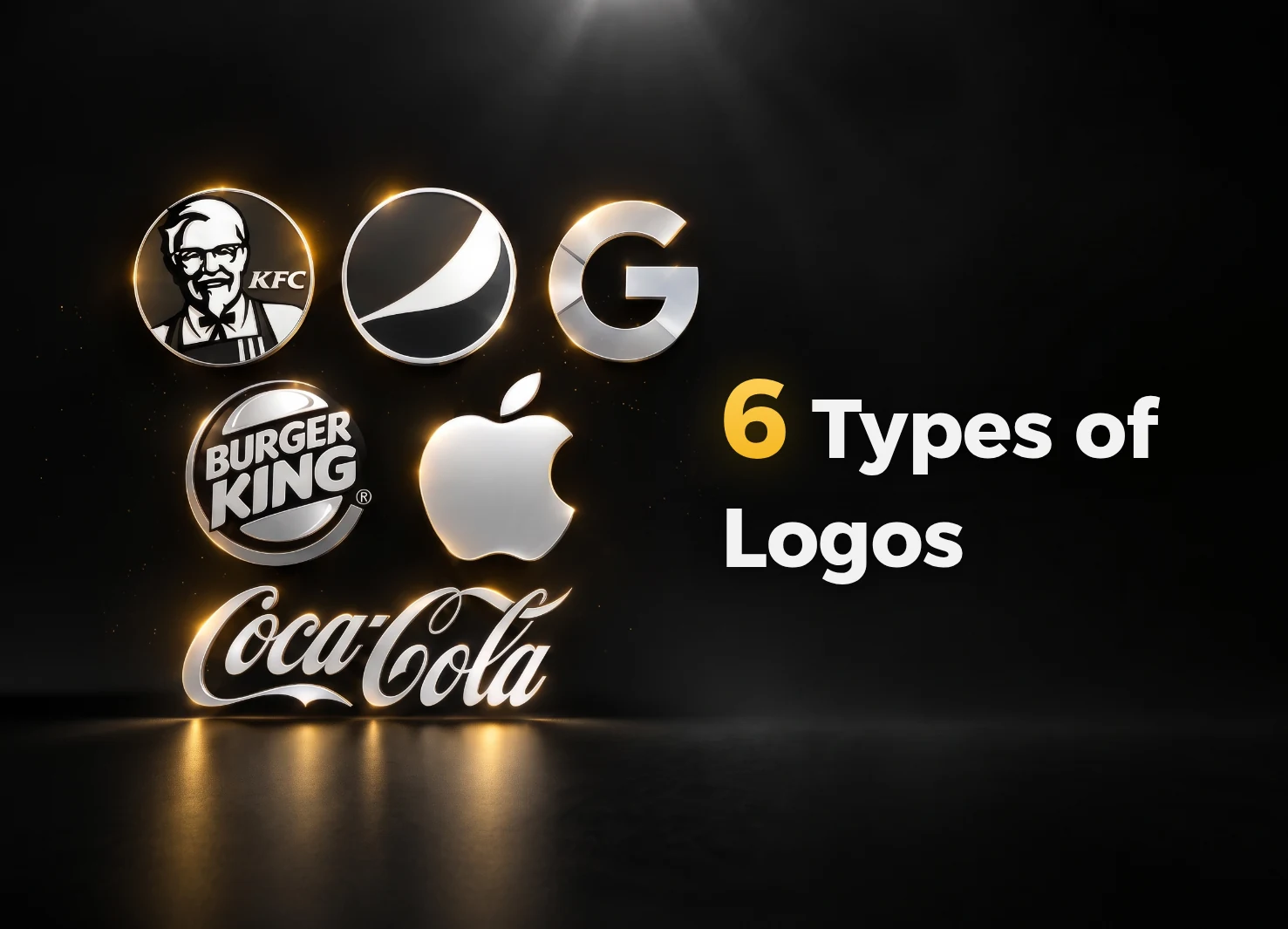
Have you ever wondered which type of logo is the best fit for your business?
Choosing the right logo is more than a design decision. It is the foundation of a strong visual identity that leaves a lasting impression on your customers.
There are several logo types to choose from, and each has distinctive qualities suited to different brand needs.
In design, there is no single logo style that works for everyone. Each type has its own purpose, visual language and effect.
In this guide, we explore the main types of logos so you can understand their differences and confidently choose the right direction for your brand. We will also look at how each type shapes brand identity.
Wordmark Logo
A wordmark uses only the brand name, presented through custom typography or a distinctive lettering treatment that gives the name its own personality.
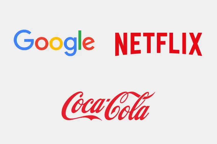
This style is ideal for brands with short, clear and memorable names, where the name itself becomes the visual signature. Well-known examples include Google, Coca-Cola and Netflix. Google’s wordmark is simple and approachable, using clear letterforms and vivid colors to express innovation and friendliness while remaining instantly recognizable worldwide.
When should you use a wordmark?
- When you want a simple logo that works easily across print and digital media.
- When your business name is distinctive and easy to remember.
- When building awareness of the brand name is a priority.
Wordmarks remain among the most widely used logo types. They are especially effective for companies that want their name to gain recognition and stay in the audience’s memory.
Lettermark Logo
A lettermark, also known as a monogram logo, reduces a company or brand name to its initials and presents those letters through a distinctive, carefully designed visual treatment.
Lettermarks are useful because they make a brand easier to remember, particularly when the full company name is long or complicated. Reducing the name to a few initials creates a simpler, clearer mark that people can recognize quickly.
Well-known lettermark examples
- IBM: Short for International Business Machines, with a clear and confident mark that reflects technology and innovation.
- CNN: Short for Cable News Network, with a mark associated with speed and credibility in news.
- HP: Short for Hewlett-Packard, using concise initials to represent a global technology brand.
When should you use a lettermark?
- When your company name is long or difficult to pronounce.
- When you need a compact logo that remains clear at small sizes and across different media.
- When you want a modern, elegant identity that communicates professionalism.

Brandmark Logo
A brandmark relies on a visual symbol or icon to represent the brand without directly displaying its name. The symbol is designed to be simple, distinctive and easy to recognize, allowing audiences to connect it with the brand immediately.
Symbols are processed quickly by the eye, which makes brandmarks easy to remember. They are also flexible across different applications and can cross language and cultural boundaries, making them particularly valuable for international brands.
Famous examples
- Apple: The bitten apple is simple, powerful and unmistakable.
- Twitter: The blue bird became a symbol of communication and freedom.
- Nike: The Swoosh is a dynamic mark that expresses movement and energy.
When should you use a brandmark?
- When the brand is already well established and customers can recognize its symbol without seeing the name.
- When you want a strong visual identity that creates an immediate impression.
- When you need a flexible mark that works easily across physical and digital channels.

Abstract Logo
An abstract logo uses shapes and colors that do not directly represent a physical object. Instead, the design expresses the brand’s ideas and values through an original visual language that can evoke a feeling or communicate a message indirectly.
This type of logo creates a distinctive visual asset that is difficult to imitate, helping a business stand out in a crowded market. It is an effective choice for companies that want to communicate innovation and modernity through a contemporary symbol that stays in the audience’s mind.
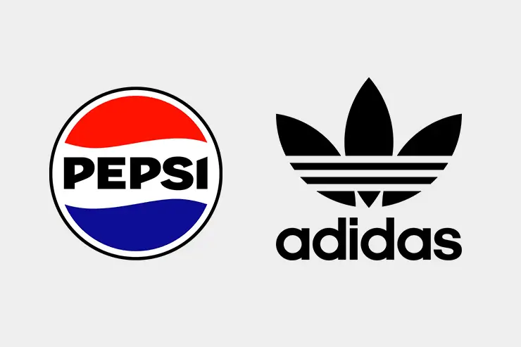
Familiar abstract logo examples include the divided circle used by Pepsi and the striped flower associated with Adidas.
When should you choose an abstract logo?
- When you want an artistic symbol that represents an idea or feeling rather than a literal object.
- When you want an original design that is difficult to copy and gives your identity a distinctive visual presence.
- When your brand serves an international audience and needs a symbol that works across languages and cultures.
- When you run an innovative or emerging company and want the identity to express progress and renewal.
Combination Mark
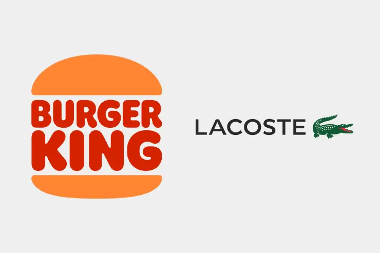
A combination mark brings a company name or initials together with a visual symbol in one design. This format is very popular because it balances words and imagery, helping people identify and remember the brand quickly. It is also flexible and can often be rearranged or simplified for different applications.
Famous examples
- Burger King: The name is integrated into a symbol that clearly suggests the product and category.
- Lacoste: The crocodile symbol is paired with the brand name.
When should you choose a combination mark?
- When launching a new brand and you want the audience to connect its name with its symbol from the beginning.
- When you need a flexible logo that can be used in more than one arrangement.
- When you want a complete professional identity that expresses the brand through both visual and verbal elements.
Emblem Logo
An emblem places text inside a shape or symbol such as a circle, shield or seal. It is often used by official organizations, schools, clubs and established companies because it creates a traditional and formal impression associated with trust and prestige.
An emblem can give a brand a strong and dependable presence. Its integrated treatment of type and symbol communicates heritage, professionalism and organization. It is especially suitable for institutions that want to emphasize their history or established position in the market.
Well-known emblem examples
- Starbucks: A circular emblem that combines the symbol and brand name.
- Harley-Davidson: A recognizable shield-shaped design.
Universities and public institutions also use emblems frequently to communicate heritage, authority and reliability.

How do I choose the right logo type for my company?
Choosing the right logo begins with understanding your business, your target audience and the qualities you want the brand to express. A short and distinctive company name may work well as a wordmark. If the name is long or complicated, a lettermark can offer a practical alternative. Businesses seeking a powerful visual identity may benefit from a brandmark or an abstract logo, while a combination mark is useful when both the name and symbol need to work together. Above all, the logo should reflect your brand’s personality, be memorable and clear, and remain effective across different applications.
Your logo is the face of your brand and the first step toward standing out in the market. A professional logo reflects your values and helps attract the right customers, making it an investment in the future of your business. Are you ready to create a logo for your company?
About the author
I’m Dana Najmah. I create professional logos, distinctive visual identities, websites and online stores that help businesses build a stronger presence, increase sales and improve their visibility in search results. Whether you are starting a new project or developing an existing brand, I can help you move forward with clarity and professional design.
Contact me through WhatsApp or visit the contact section to begin your next digital project.